Creating your White Label Ticket Shop: BrandingAdded: 16th Jan 2013
Category: Getting Started
Once you’ve completed the inital setup of your White Lable Ticket Shop, your next step is to customise the look of the Ticket Shop so it fits with your branding. If you have an existing website and you wish to tie your Ticket Shop into that then our Development Team can help with that, e-mail us at dev@skiddle.com for more information.
Theme and Colours
The first choice you must make is which theme to use for your Ticket Shop. Currently we have two themes for you to choose from; Dark and Light.
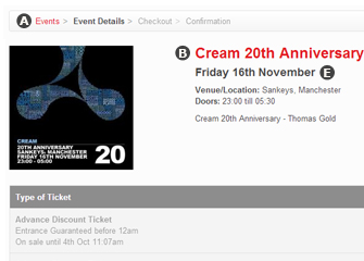
When you’ve decided which theme you want to use, it’s time to customise the colours of your Ticket Shop. You can select your desired colours using our simple-to-use colour picker. Simply click on the relevant box and the colour picker will be displayed, allowing you to easily pick the colour you want.
The Link Colour will be applied to all text links on your Ticket Shop, and the Link Hover Colour dictates the colour they will change to once a customer hovers over them.
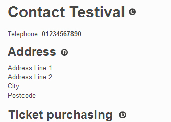
H1 Colour will change the main page headings of your Ticket Shop, H2 Colour will change the secondary page headings, and H3 colour will change the smaller headings.


A - Link
B - Event Title
C - H1
D - H2
E - H3
Width, Alignment and Font
We also allow you to set the maximum width of your Ticket Shop in pixels. This will allow you to ensure that your Ticket Shop matches the width of your website, if you have one. If you elect not to define a Page Max Width it will be set to a default of 1170px. The page width, regardless of the Page Max Width, will change to suit the customer’s screen resolution, providing them with the most rewarding shopping experience possible.
Banner alignment allows you to either left, right, or center align your banner image depending on how you feel it looks best.
The font picker gives you six options to customise the typography of your Ticket Shop. To see what a certain option looks like simply select it from the list and a preview of the text style will be shown underneath the font picker box. The font you choose will go a long way to setting the tone of your Ticket Shop.
Once you’re happy with your choices, you can click “Preview Styling” to go to your Ticket Shop and see what it will look like once your choices have been applied. If you don’t think something works, fear not, you can just close the preview and change the relevant option to something more suitable.
Banner Images
Your final options for branding your Ticket Shop are uploading a Banner Image and a Email Header Image.
The banner image is a way in which you can really display the branding of your Ticket Shop, and most people will use the logo of their club night, venue, etc. We advise that you don’t upload a banner with a height greater than 250px but the width of your banner image is only limited by the Page Max Width you defined.
The Email Header Image will be placed at the top of the email receipts your customers will recieve. The maximum width of an Email Header Image is 607px and the maximum height is 150px. In the absence of an Email Header Image, your email receipts will feature the Skiddle logo.
article categories
Once you’ve completed the inital setup of your White Lable Ticket Shop, your next step is to customise the look of the Ticket Shop so it fits with your branding. If you have an existing website and you wish to tie your Ticket Shop into that then our Development Team can help with that, e-mail us at dev@skiddle.com for more information.
Theme and Colours
The first choice you must make is which theme to use for your Ticket Shop. Currently we have two themes for you to choose from; Dark and Light.
When you’ve decided which theme you want to use, it’s time to customise the colours of your Ticket Shop. You can select your desired colours using our simple-to-use colour picker. Simply click on the relevant box and the colour picker will be displayed, allowing you to easily pick the colour you want.
The Link Colour will be applied to all text links on your Ticket Shop, and the Link Hover Colour dictates the colour they will change to once a customer hovers over them.
H1 Colour will change the main page headings of your Ticket Shop, H2 Colour will change the secondary page headings, and H3 colour will change the smaller headings.


A - Link
B - Event Title
C - H1
D - H2
E - H3
Width, Alignment and Font
We also allow you to set the maximum width of your Ticket Shop in pixels. This will allow you to ensure that your Ticket Shop matches the width of your website, if you have one. If you elect not to define a Page Max Width it will be set to a default of 1170px. The page width, regardless of the Page Max Width, will change to suit the customer’s screen resolution, providing them with the most rewarding shopping experience possible.
Banner alignment allows you to either left, right, or center align your banner image depending on how you feel it looks best.
The font picker gives you six options to customise the typography of your Ticket Shop. To see what a certain option looks like simply select it from the list and a preview of the text style will be shown underneath the font picker box. The font you choose will go a long way to setting the tone of your Ticket Shop.
Once you’re happy with your choices, you can click “Preview Styling” to go to your Ticket Shop and see what it will look like once your choices have been applied. If you don’t think something works, fear not, you can just close the preview and change the relevant option to something more suitable.
Banner Images
Your final options for branding your Ticket Shop are uploading a Banner Image and a Email Header Image.
The banner image is a way in which you can really display the branding of your Ticket Shop, and most people will use the logo of their club night, venue, etc. We advise that you don’t upload a banner with a height greater than 250px but the width of your banner image is only limited by the Page Max Width you defined.
The Email Header Image will be placed at the top of the email receipts your customers will recieve. The maximum width of an Email Header Image is 607px and the maximum height is 150px. In the absence of an Email Header Image, your email receipts will feature the Skiddle logo.

